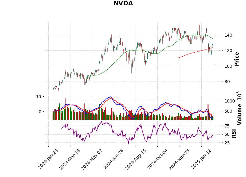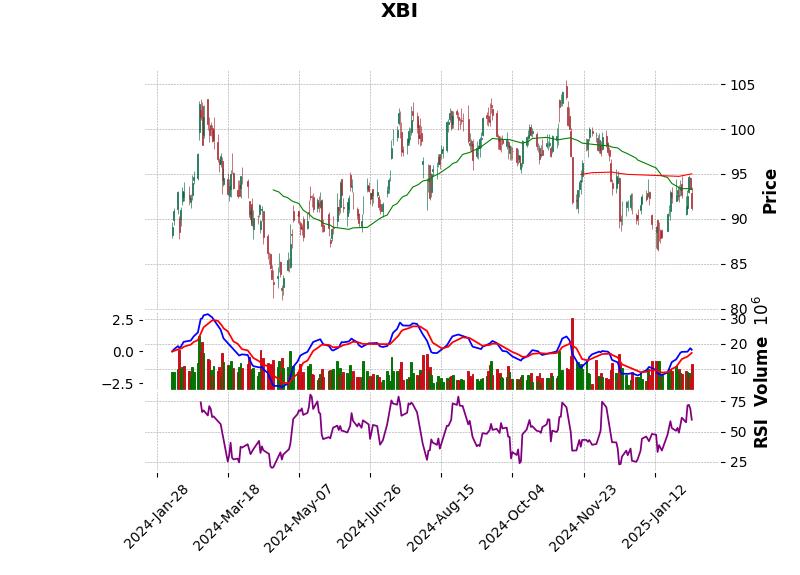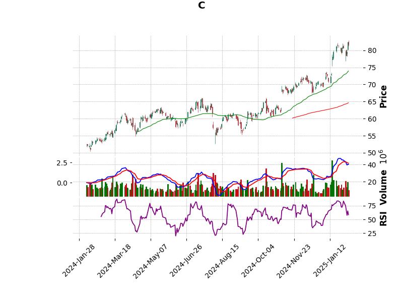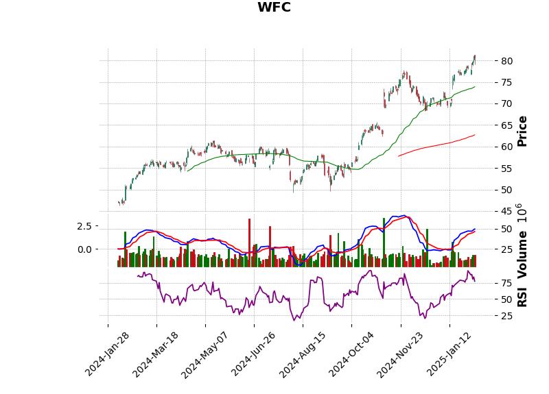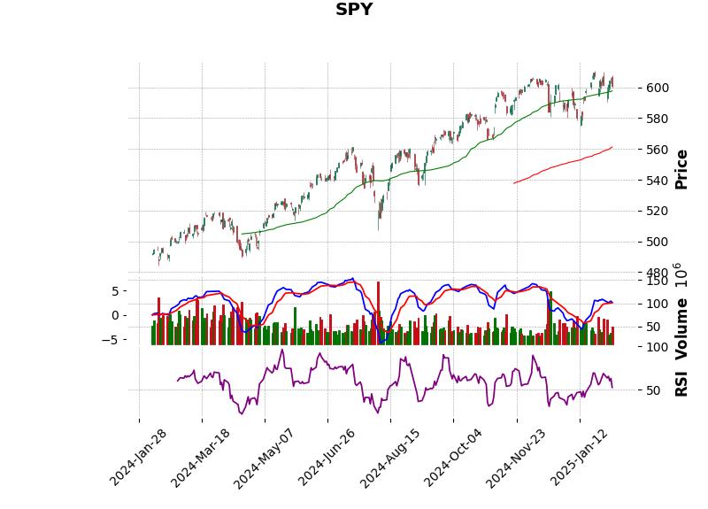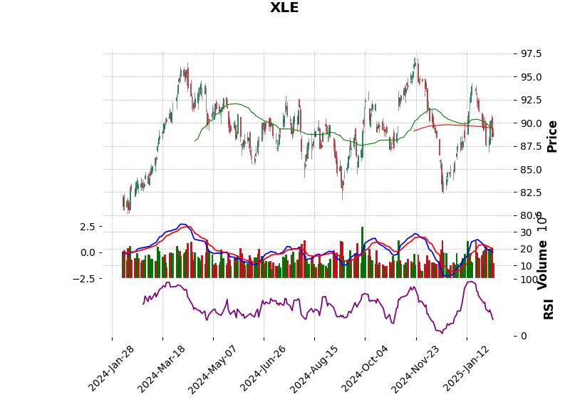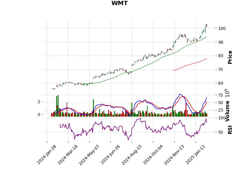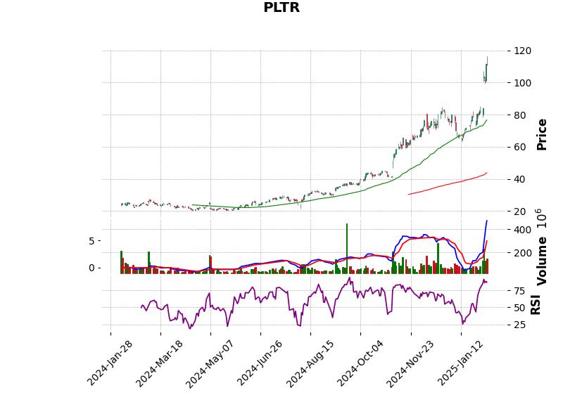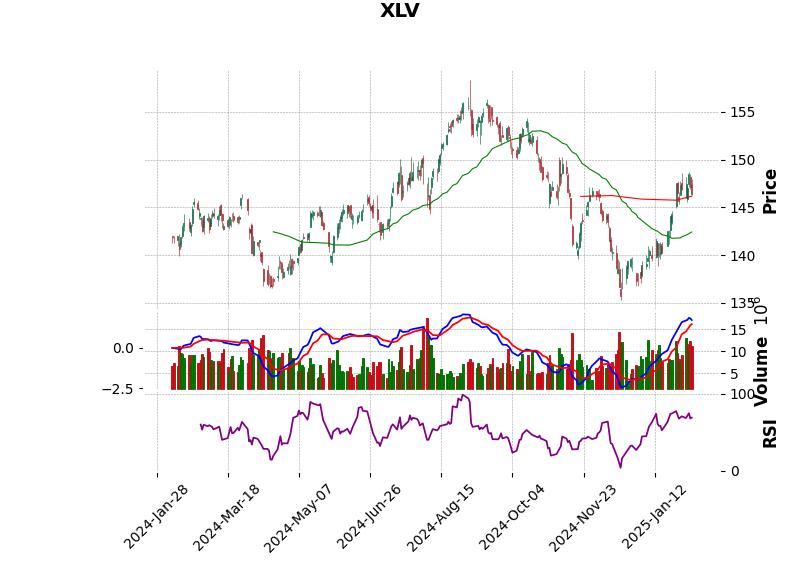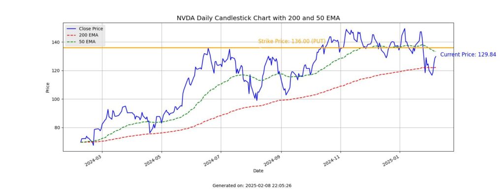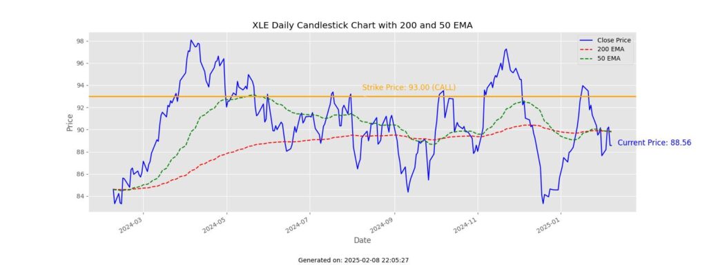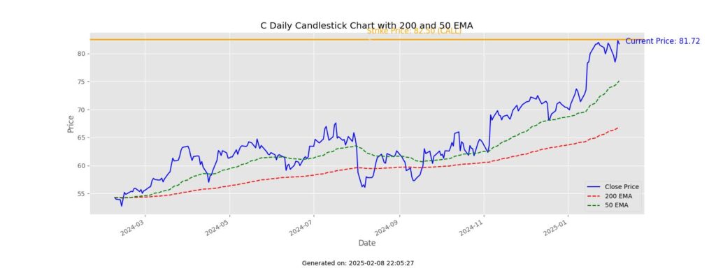

I’ve been working on some python code and the mplfinance, matplotlib, yfinance python libraries to generate the images below. Many of them I have covered called or cash covered puts in which I roll monthly.
import yfinance as yf
import matplotlib.pyplot as plt
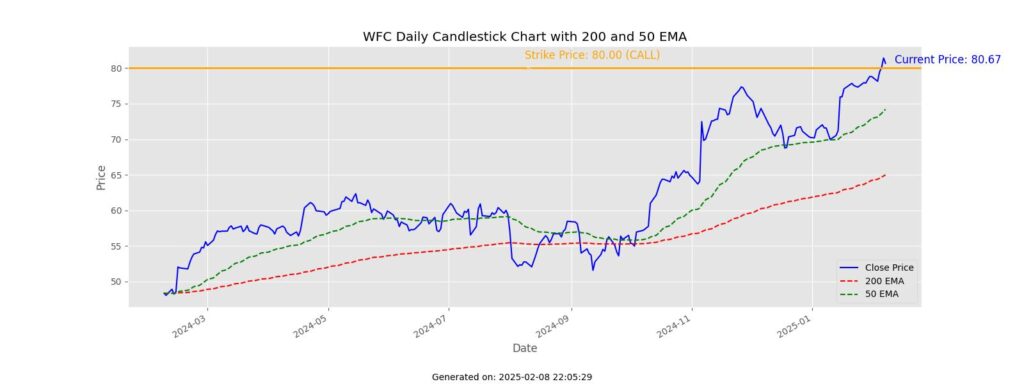
import mplfinance as mpfThere are a couple types of graphs. The first type are candlestick charts that have the RSI, MACD, and 50/200 Exponential Moving Averages. The second type is a line graph with the EMAs, but also have a yellow line drawn at the strike of my call or put. It’s a nice visualization for me and gives me a quick sense of where the trade is headed. I’d like to combine the 2 into one and move to a weekly, but also add a simple daily line graph to get a sense of the trading day.
Are there indicators you would like to see added that have helped you trade options? Perhaps Average True Range or Bollinger Bands?